
You read the label. You step closer. You look again, because the text now seems to describe the case next to it. That “switching” feeling doesn’t belong to one famous museum or one documented incident. It shows up in lots of places, from a big, busy gallery like the British Museum in London to smaller local history rooms where one person is doing the mounting, cataloging, and printing. The core mechanism is mundane: labels are physical objects in a moving space, and exhibits are physical objects in a moving schedule. The weird part is how quickly the brain decides something “must have changed,” even when the change was just a millimeter of drift or a quiet update no one announced.
How labels end up “switching” without anyone touching them
The simplest version is that nothing swapped. The visitor did. A gallery encourages you to glide along a wall, angle toward a spotlight, then pivot to a new object. If the labels are mounted in a straight line but the cases are staggered, the nearest label may not belong to the nearest thing. A one-step shift left or right can attach the wrong text to the wrong object in your head.
A specific detail people overlook is the baseline. Museums often align labels to an architectural feature, like a rail or a consistent height from the floor, not to the center of each object. That looks tidy. It also means a small sculpture and a wide painting can share the same label rhythm, even if the “correct pairing” depends on where you’re standing.
Real, routine reasons the match actually changes

Sometimes the match does change, but slowly and legally. Objects get rotated for light exposure, loan agreements, conservation breaks, or because a new acquisition needs a slot. The wall text might be accurate on Monday, and slightly off by Friday if the install team moved one item to balance spacing and didn’t reprint every small label. In a busy institution, the printing queue can lag behind the physical moves.
There’s also the “temporary fix” that becomes semi-permanent. A label can be removed for cleaning, reattached with fresh adhesive, and land a few centimeters off. That sounds too small to matter until you remember that two objects in adjacent cases might be separated by only a narrow seam, and the label holder is shared.
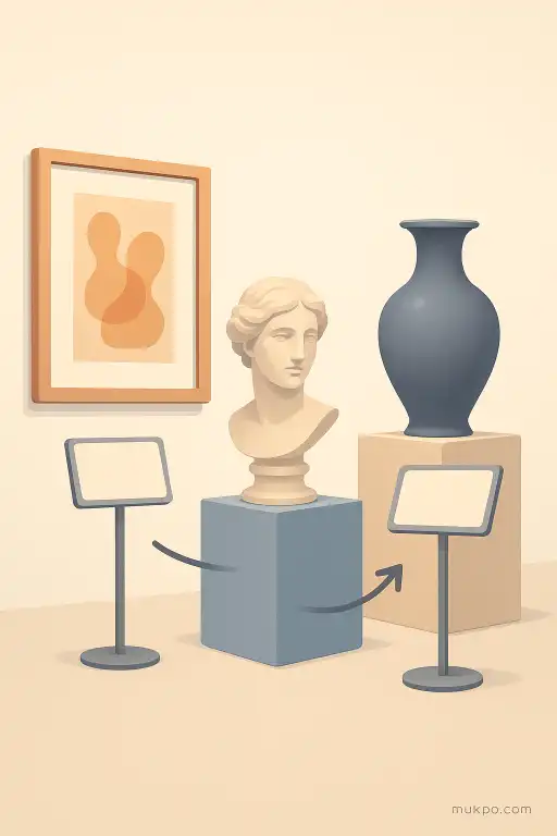
When a gallery has multiple label systems at once
Many rooms run two or three parallel systems: an object title label, a longer interpretive panel, and a number that connects to an audio guide or a phone app. Those systems don’t always update together. If the app is keyed to “Object 12” but the wall number “12” was moved during a reinstall, the digital description stays stable while the physical number drifts to a different piece.
Even inside one system, museums mix formats. Some labels describe a single item. Others cover a cluster, like “Tools from the Iron Age,” meant to apply to a whole case. If one tool gets pulled for conservation and replaced by something similar, the label remains “true,” but the visitor experiences it as if the words slid sideways onto a new object.
The human brain supplies the “switch” feeling
Galleries ask for quick reading under imperfect conditions: low light to protect materials, glare from glass, crowds, and a lot of similar objects. Under that load, people don’t keep a strict map of what they’ve already matched. They form a fast pairing: nearest label equals nearest object. Then they correct it later and feel a jolt, like something changed.
A common trigger is re-reading. You glance, interpret, then look back after seeing the neighboring object. Your new context changes what the words seem to point at. The label didn’t move, but the “attachment” in your mind did. In rooms with repeated shapes—ceramic bowls, coins, pinned insects—this happens constantly because the objects don’t anchor memory the way a single iconic piece does.
Small design choices that make switching more likely
Spacing is a big one. If two labels are close together, the eye can skim both and merge the details. Another is arrow use. Some museums avoid arrows because they clutter the look, but the absence of arrows means the visitor must infer direction from layout alone. A third is glass reflections that hide the mounting point, so you can’t tell which label holder belongs to which case.
The most fragile setup is a long wall of cases with uniform label strips and frequent object rotations. It looks clean. It also creates a situation where a tiny shift in placement, a delayed print update, or a small crowd forcing you to stand off-angle can make the room feel like it’s quietly reassigning names while you’re still reading.
Related reads
- Why compliments stick: the brain’s unexpected bias
- When a medieval abbey traded relics for grain to survive a siege
- A neighborhood that replaced street names with emoji for a month
- Why familiar places trigger sudden vivid memories
- How hammerhead sharks detect electric fields
- How three lighthouse keepers vanished from a Scottish isle in 1900