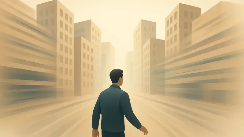
That weird moment when every corner feels familiar
Walk a few minutes through Manhattan’s numbered streets and it can get strangely slippery. You know you’re moving. You can see traffic, storefronts, people. But after a handful of identical-looking blocks, the mental map starts to smear. This isn’t one single “city problem.” It shows up in parts of Chicago’s grid, in Barcelona’s Eixample, and in newer planned districts where the blocks repeat. The core mechanism is simple: the brain leans hard on distinctive cues to keep track of where you are, and repetitive streets quietly remove those cues while still feeling easy to navigate.
Your brain anchors to landmarks, not to distance
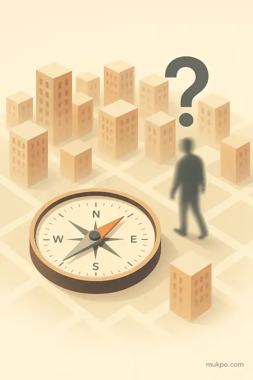
People tend to think they navigate by counting blocks or holding a tidy north-south map in their head. Often, they don’t. A lot of everyday orientation is built from landmarks and “decision points,” like a particular corner store, a plaza, a bridge, or a building with a weird shape. When those anchors are missing or duplicated, the brain has less to pin “here” onto. You can still know the rules of the grid. You just lose the feeling of place that normally rides alongside it.
A specific detail people overlook is how much orientation depends on the uniqueness of intersections. If every crossing has the same width, the same curb shape, the same tree spacing, and the same type of storefront lighting, you don’t get a strong “I’ve been at this exact corner before” signal. That weakens your internal record of turns and progress, even if you’re paying attention.
Repetition creates false familiarity
Repetitive blocks don’t just remove information. They add a kind of misleading information. When a place looks like other places you just passed, your sense of recognition can fire without being tied to the right location. That can make a street feel simultaneously familiar and hard to place. It’s not that the brain can’t tell streets apart in principle. It’s that the normal shortcut—pattern recognition—keeps returning the same answer.
You can see this in a simple situational example: someone steps out of a subway station onto a long avenue, walks three identical blocks, and then tries to point back to the entrance. If the corners all share the same chain stores, the same glass-and-stone façade style, and the same signage height, the person may be confident and still be wrong. The confidence comes from recognition. The error comes from recognition not being specific enough.
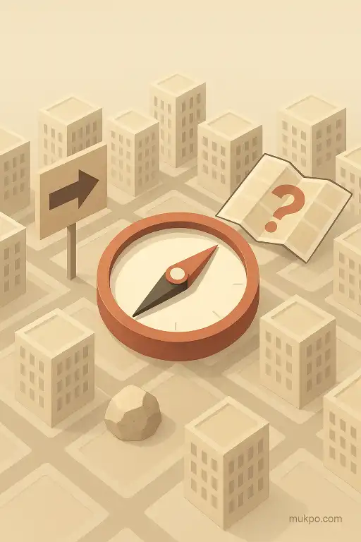
The grid helps navigation but can hurt orientation
A grid is great for rule-based navigation: left, right, three blocks, and you’re there. But the same regularity can reduce the “shape” of a route in memory. Curvy streets and irregular neighborhoods generate varied turn angles and unexpected vistas. Those become easy separators in the mind. A grid repeats the same turn over and over. After a while, the path doesn’t have a distinctive outline. It becomes a stack of similar segments.
Numbered streets add another twist. They are logical and still blur. “47th” versus “49th” is a strong system on a map, but it’s weak as a sensory experience if the blocks between them look and sound the same. That mismatch matters because people don’t store the world as a clean list of labels. They store it as a mix of labels and sensory snapshots, and the snapshots can be nearly identical in some districts.
Small asymmetries matter more than you’d think
Orientation often rides on tiny asymmetries that don’t feel important until they’re gone. The sun angle between tall buildings can be hard to read. Wind can channel through streets in consistent directions, but it varies and is easy to ignore. Even traffic flow can be symmetrical if avenues run one-way in alternating directions. When those cues don’t clearly separate “this block” from “the next block,” the brain has fewer independent checks.
That’s why two blocks can be technically different and still mentally interchangeable. A single distinctive cue—an unusually wide doorway, a tree with a different species, a bright awning on only one corner—can do a lot of work. In neighborhoods designed to look uniform, those quirks are often minimized on purpose. The street stays visually calm. The cost is that your internal map has fewer hooks to hang onto as you move.
Related reads
- What household biofilms in drains reveal about microbes and cleaning
- When ancient Rome’s Vestal Virgins faced scandal, trial, and ritual punishment
- Why applause rolls through a crowd in surprising waves
- How desert beetles harvest fog with bumpy shells
- Why people apologize for tiny slip ups even when they aren’t at fault
- How tiny ice crystals sculpt snowflakes in midair