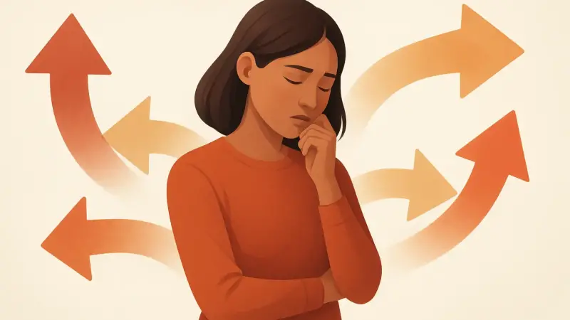
The everyday moment where choice turns heavy
Scrolling a streaming app can feel oddly exhausting. Netflix is a common example because it puts thousands of titles in one place, and the menu keeps refilling itself. This isn’t one single event or one single place. It shows up in supermarkets in the US and UK, in phone plan pages, and in restaurant delivery apps in big cities and small towns. The basic mechanism is simple: each extra option adds extra comparisons, extra trade-offs, and extra chances to doubt your own pick. The decision stops feeling like a quick preference and starts feeling like a test you might fail.
A small detail people overlook is that the “number of options” is not just the grid on the screen. It includes hidden variants: sizes, bundles, delivery windows, add-ons, subscription tiers, and “recommended for you” lanes that keep rewriting what counts as the set of choices.
More options create more comparisons than people expect
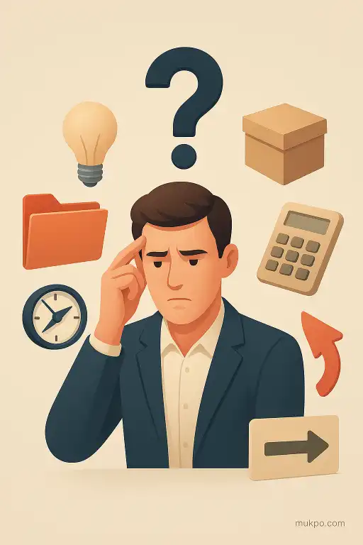
When there are only a few choices, the brain can compare them in a rough, human way. With lots of choices, comparisons multiply. It isn’t one choice versus a list. It’s a growing number of pairwise checks: this one against that one, then against another, plus all the “but what if” branches. Even if each comparison feels small, the total workload balloons.
That workload isn’t only mental math. It’s also remembering what was already seen, keeping criteria consistent, and noticing differences that might not matter. People often end up rereading the same specs or re-checking the same reviews because they can’t hold the whole landscape steady in mind.
Opportunity cost becomes the loudest voice
With a bigger menu, every “yes” drags a longer tail of “no.” The cost isn’t money. It’s the feeling of giving up other futures. If there are three decent options, skipping two doesn’t feel dramatic. If there are eighty, the rejected possibilities feel endless, even when most of them were never realistic contenders.
This is why people can feel stuck even after they’ve narrowed the field to “good” choices. The mind keeps scanning for a reason to justify closing the door. It becomes harder to accept that picking one decent thing means letting many decent things go untouched, and that’s true even when the differences between them are tiny.
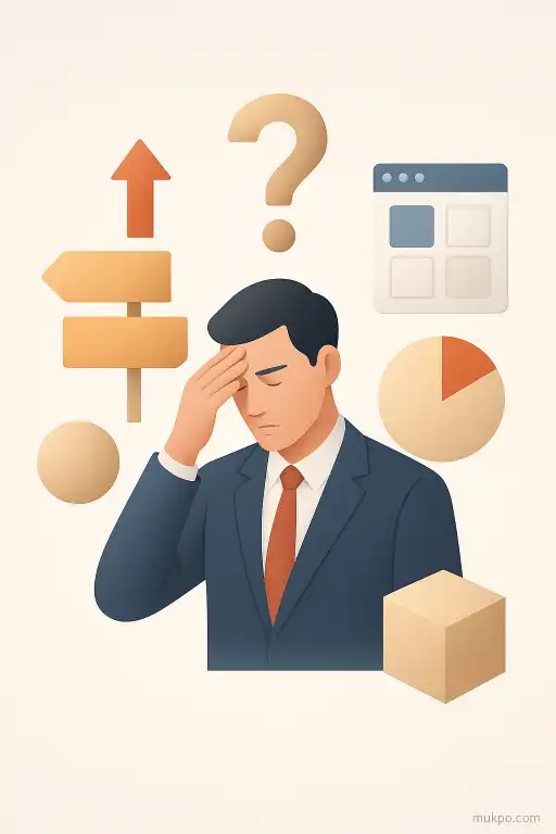
Too many options raise the standard to “the best”
Abundance quietly changes the goal. Instead of finding something that fits, the decision turns into a search for the optimal answer. That shift happens fast when filters, rankings, and star ratings are visible. The interface itself suggests there is a top choice and that it’s findable if you work hard enough.
A concrete example shows up in buying something boring, like headphones online. Once dozens of models appear with tiny feature differences, people start treating the decision like a long-term identity statement. A small uncertainty—battery life in cold weather, how they sound with podcasts, whether the earcups get warm—starts to feel like a serious risk, because “the best” is assumed to exist somewhere in the pile.
Regret and responsibility get amplified by the menu itself
Large choice sets can make regret feel personal. If there were only two reasonable options, a disappointing outcome feels like bad luck. If there were fifty, disappointment can feel like a mistake that should have been avoidable. More options make it easier to imagine the alternate timeline where a different pick would have fixed everything.
The menu can also create a subtle pressure of responsibility. Recommendations, “people also bought,” limited-time badges, and constantly updating availability make the choice feel time-sensitive and socially graded at the same time. Even when nothing truly urgent is happening, the shifting display can make people feel behind, as if the right answer is moving and they’re failing to catch it.
Related reads
- Why strangers’ glances sometimes feel like being watched
- Why Saturn’s rings vanish and reappear depending on our viewpoint
- When an entire harbor froze solid and the climate mechanics that caused it
- Why the walking palm appears to relocate and the root mechanics behind it
- The bakery oven that chimes at midnight with an impossible melody
- When uncontrollable laughter spread through Tanganyika schools in 1962